FrontRow.Explore / Membership ↗
THE DROP
DOESN’T WAIT.
DOESN’T WAIT.
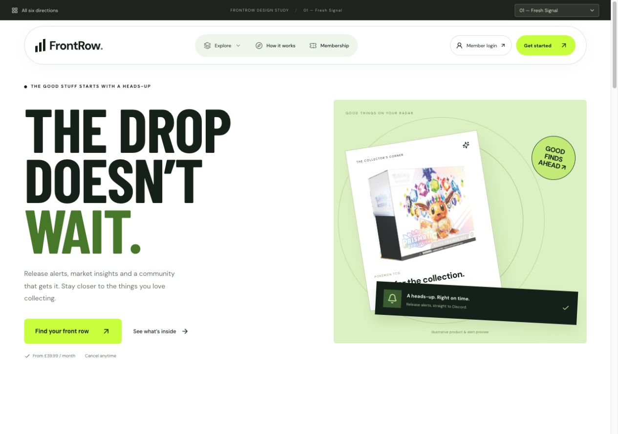 Explore direction
 White & green. A clean split layout with a floating capsule menu, oversized type and a bright product composition.
Six working variations, built around the directions you liked. Explore the new menus, shortlist your favourites, and compare the details.
Compare side by sideExplore direction White & green. A clean split layout with a floating capsule menu, oversized type and a bright product composition.
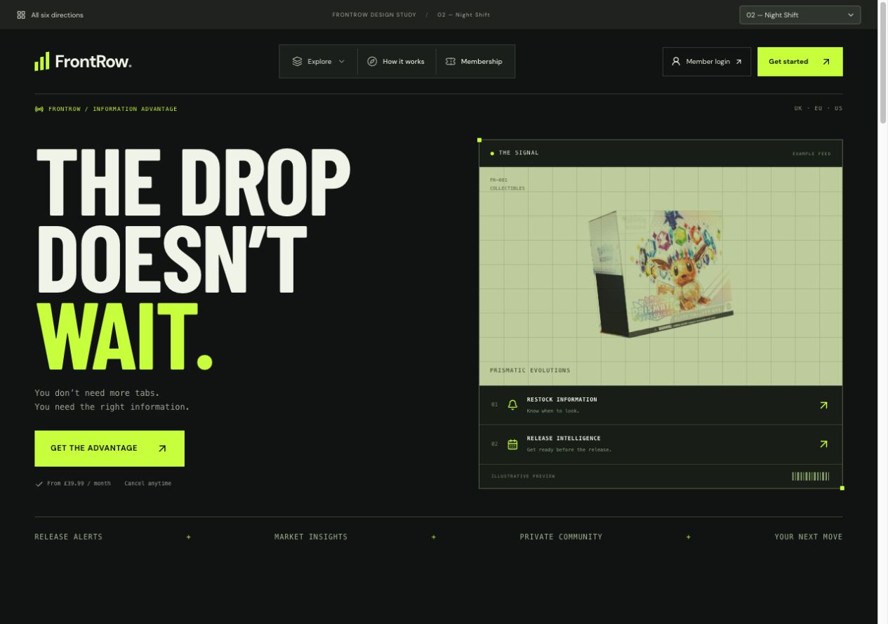 Explore direction
 Black & green. The original favourite: condensed type, electric accents, a segmented menu and a product monitor.
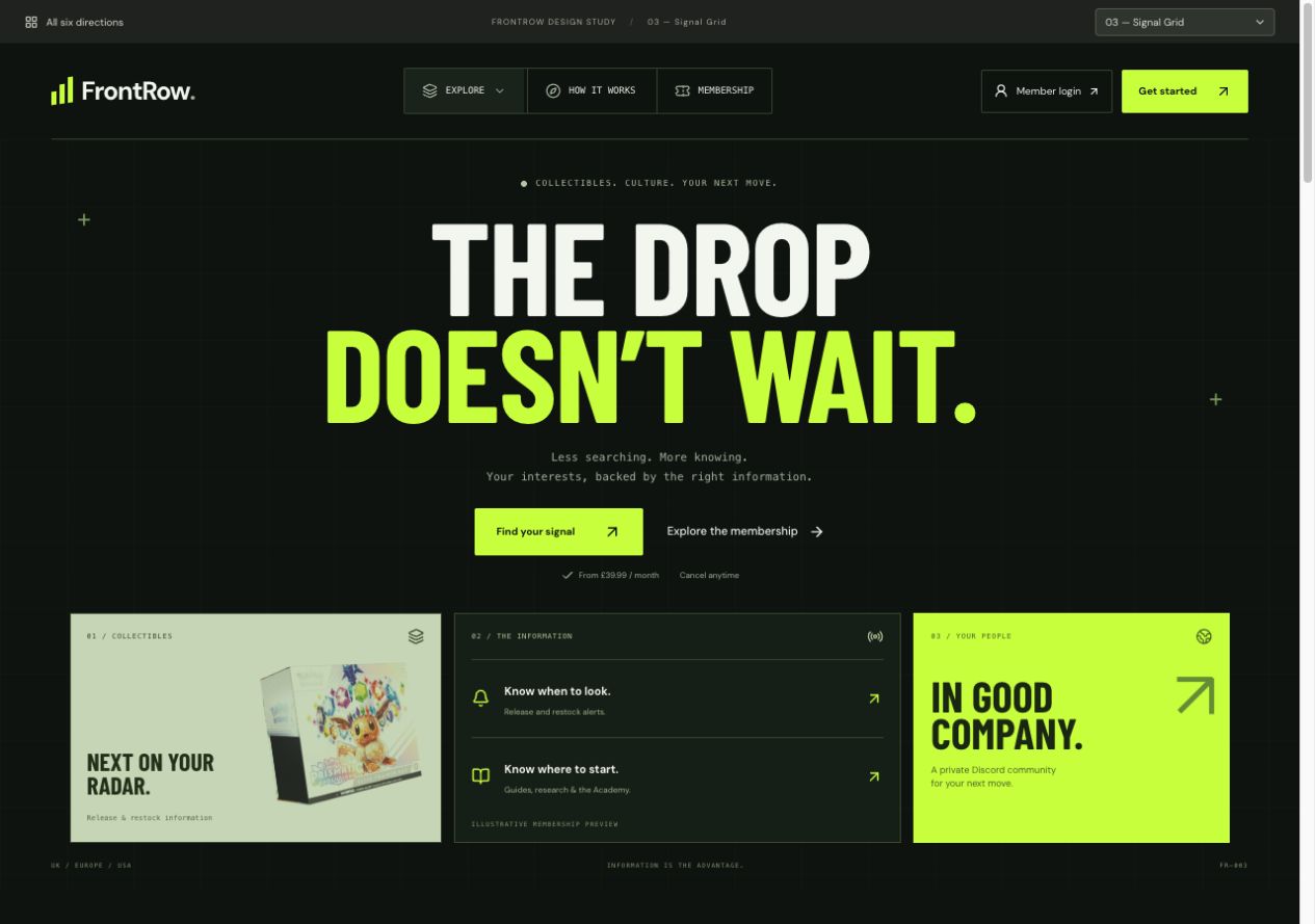 Explore direction
 Black & green. A new take on 02 with a centred headline, a command-bar menu and three structured information panels.
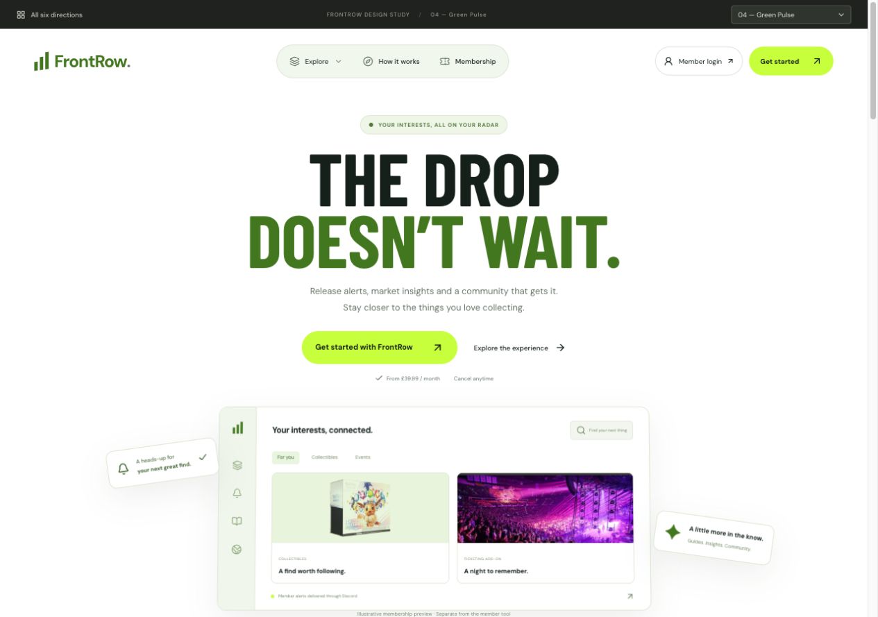 Explore direction
 White & green. A rounded menu, centred typography and a clear membership preview for a polished digital feel.
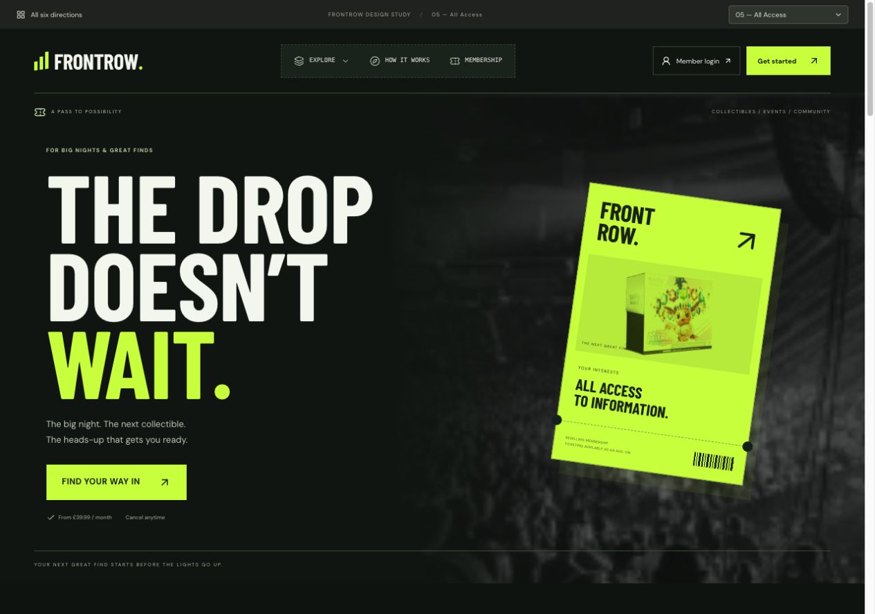 Explore direction
 Black & green. The bold layout from 05, reworked with a green admission pass, atmospheric photography and ticket-style controls.
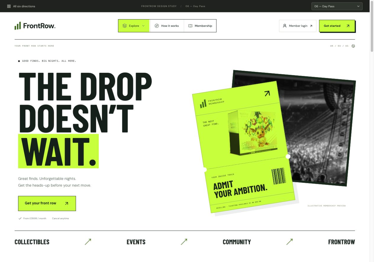 Explore direction
 White & green. A new take on 05 with a crisp white canvas, a green graphic pass and bold black typography.
Notice the typography, energy, page structure and how the product is presented. You can mix the strongest parts of different directions.
Compare your favourites